

Brown Tide. The Brown Menace. Browntown, Gamesville.
Whatever you call it, the average colour palette of modern games is a sore point for many gamers. Some claim it adds realism, while others say it's a cheap way to hide poor artistic direction, but just how much of a problem is it? Have games really become more brown over time? If so, whose fault is it? And can we make a lucrative claim for compensation?
As always, Checkpoint Restart is on hand to ask the tough questions. In this exclusive exposé, we'll use the power of science to critically analyse a suite of metrics and reach a number of key findings! At least, that's what our engineers said when we spoke to them earlier.
The New System
Helping us along the way will be a brand new analysis technique, which we're calling:'Average Range and Saturation of Chroma Hue Examined in Entertainment (eXtended)'.
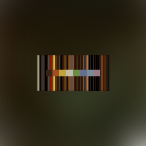
In layman's terms, it produces pretty little pictures showing the average colour palette of any given game.
 |
| Example ARSCHEEX output |
Armed with these objective overviews, we can come to a quantifiable value of the blandness of a given game's colour palette - a 'Brown Factor', if you will.
* * *
ID Software
For the purposes of ensuring a fair and balanced evaluation of games across the industry, we've singled out Id Software for intensive examination. Established in 1991, this cowboy outfit is generally regarded as one of the worst offenders for slathering their games in muddy, brown textures, but I'm legally required to say we're not biased against them.We'll be taking a brief journey through the majority of their catalogue as a developer, and hopefully getting to the bottom of the
Commander Keen, 1990

Brown Factor: 0.5
Wolfenstein 3D, 1992

Brown Factor: 2.2
Doom, 1993

Brown Factor: 4.1
Quake, 1996

Brown Factor: 9.6
Quake II, 1997
Brown Factor: 8.9
Quake III, 1999

Brown Factor: 7.0
Return to Castle Wolfenstein, 2001

Brown Factor: 8.3
Doom 3, 2004

Brown Factor: 7.8
Quake 4, 2005

Brown Factor: 4.4
Wolfenstein, 2009

Brown Factor: 1.6
Rage, 2011

Brown Factor: Off the charts
* * *
By the power of the ARSCHEEX system, we made a last-ditch attempt to claw something colourful out of this mess from a combined average of the entire Id Software catalogue.
Combined Average, 1990-2011

* * *
Conclusions
So that's that, then. To paraphrase Spinal Tap, how much more brown could this be? And the answer is none. None more brown.Astute readers will no doubt already be partway through writing an angry comment, pointing out that we haven't fed 2014's Wolfenstein: The New Order through our ARSCHEEX. Let me assure you that we'd never deliberately make such a mistake. The truth is that the system just wasn't designed to process this much brown. This was military grade hardware, but astonishingly the Id Software catalogue has melted it through sheer 'over-browning'.

I'm assured by our top engineers that, with careful administering of Dulux colour charts, the system could be back up and running in a matter of weeks, but tragically may never be able to analyse an Id Software game again.
If you're reading this and you happen to work in the Id Software graphics department, please consider investing in some primary colours - for the sake of our technology, if nothing else.


0 comments :
Post a Comment